
matching fonts can give your
design the professional look
that you desire.
15 Best Examples of Good Designs to Use
It is expected of every graphic designer to create good looking designs in order to establish a connection with their clients or viewers.
As a graphic designer, you create visually impactful and memorable designs by using the proper design format.
Here in this article, we have provided the best examples of good designs to use in your projects so as to come up with awesome designs that can captivate your audience.
15 Best Examples of Good Designs to Use
- Proper readability
- Matching fonts
- Accurate kerning or letter spacing
- Colors
- Negative or blank space
- Alignment of elements
- Contrast
- Rational scaling and sizing
- Visual hierarchy
- Texture
- Use of proper picture format
- Balance
- Shapes
- Case
- Use of gradient.
- Proper readability
Readability refers to the arrangement of words and blocks of type on a page.
Proper readability attracts the attention of the readers on the content of a design meant to pass information.
For a design to have a proper readability, the content shouldn’t bear too many words in one line. A design with good readability, each line should have the least of 50 to 60 words and characters.
What makes a good design is its ability to pass across the intended information to its audience clearly so they can understand the content without thinking twice in most cases.
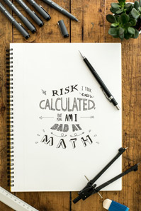
- Matching fonts
The combination of matching fonts gives a design the intended and professional look. When the right fonts are used in a proper way to describe a design, it makes the whole content look organized and appealing to the eye.
While selecting fonts, consider the class and personality you are designing for, some categories of fonts can match and communicate informality while some fonts are used for formal projects.
- Accurate kerning or letter spacing
Kerning is the act of adjusting spaces in between letters either manually or automatically to make the words or sentence more comprehensible.
Letter spacing or kerning has a huge impact on headlines, paragraphs, logo designs and any design that involves typography.
It is the distancing of each pair of letters. The use of kerning and adjusting the space between letters enhances the readability of words and in return makes the content or design pleasing to the readers.
- Colors
Color portrays the mood of the visual design. Color illustrates different emotions and it is also used to interpret different personalities.
Red color can represent anger, love, and passion or strong will while blue color incites a sense of peace, goodwill, cool, and security.
Choice of color combination is the most important aspect of designing. Choose colors moderately and intelligently in your design, to make your design attractive and to draw attention to important items on your design.
Effective coloring contributes to the unity of the whole design and helps to lay emphasis on the pertinent information the graphic designer is trying to convey with visual elements.
- Negative or blank space
This negative or blank space is also known as white space. This is an empty, open, and underutilized area of any design content or creation.
Negative space is the active and visible distance between the visual elements in a project design.
Negative space is mostly utilized when you want to deliver or point out a direct message without the interference or clutter of other design elements which might hide the intended meaning of the design.
- Alignment of elements
Alignment is a type of design principle that refers to the organization, order, and arrangement of the various elements. Alignment creates a visual connection between elements.
Alignment aims at organizing visual elements in a readable arrangement. A well aligned element creates an orderly and accurate symmetry in your designs.
Properly aligning of visual elements arranges the content in a sequential order so that the consumers of the design can take a quick glance on the content and still have a firsthand understanding of the information the design is passing across.
- Contrast
Contrast is the difference between two colors or elements in terms of brightness, lightness, or hue that makes them more or less distinguishable.
Contrast is mostly used to make emphasis and make elements stand out to grab attention of the viewers.
It creates a focus or a focal point in a visual design. Creating designs with contrast is a good design strategy that creates visual excitement and boosts the attractiveness of the art creation.
Color contrast redirects the attention of the audience to the more important aspect of design.
Higher contrast color should be attributed to vital element that is meant to pass information rather than the minor visual elements.
- Rational scaling and sizing
Scaling brings balance, proportion, and contrast to visual design. Scale and proportion are used to measure the exact size of an element and differentiate the size of two objects in the visual presentation.
Proper scaling is an act of good designing skills in producing a great design used to make all the visual elements, including typography, lines, and images to appear in the right size and shape.
- Visual hierarchy
Visual hierarchy is a good design strategy to use and an important principle in graphics designing that helps to direct the viewers’ attention to the importance of each element according to the ranking.
Visual hierarchy uses the largest texts or images to point out the most important details in the design content that passes the most required information.
- Texture
Texture is the surface composition and quality of an art work. Adding texture is a good creative design element that makes the design look realistic and unique, and it increases the visual value of the design.
Texture can be used to make significant attribution on a particular area of the visual design to make it more predominant than the other visual elements.
- Use of proper picture format
Picture format is also responsible for the color quality of a design. Quality color makes up a good design.
Raster images and vector images are the major picture format used in graphic designing. Raster images are made up of few pixels which become pixelated when stretched or enlarged.
Raster images are gotten mostly when exporting images from Adobe Photoshop program.
Another picture format is vector images; they are made up of geometric curves and lines which make them scalable to any size and it will still maintain its colorful state.
- Balance
Balance helps to give design stability and distribute the visual elements evenly within your design.
Balance gives an even spacing and appearance that is professional and attractive instead of being disarray and jumble.
Balance means the elements being symmetrical and asymmetrical. Elements don’t need to be the same size or distributed evenly on the page.
- Shapes
Shapes are formed when elements are combined to create an icon or symbol. The use of shapes is also to indicate a particular portion in a page.
Shapes add interest to your elements. Shapes are used to represent or indicate different personalities.
Shapes like angular shapes represent masculinity while circle and curvy shapes represent femininity.
- Case
A case is the nature of a piece of alphabetic type, whether an upper case (capital) or lower case (small) letter.
The special use of letter cases in typography is an opportunity only few designers take advantage of this technique’s potential.
Writing a sentence using an uppercase has an effect in making the sentence look more important and dragging the attention of the reader to the sentence.
Headlines are written mostly using an upper case.
- Use of gradient
Gradient is a color transitions and a gradual blend from one color to another color. Gradient can combine and blend two or more colors.
Gradients create new color combinations that give the design a new feel, different and modern look, which makes the design to have a completely unique feel to make.
Gradients lend a unique feel to your logo and other designs that help you stand out from your adversaries.
Conclusion
This post has provided you with good design examples; you can now put the visual communication elements into practice so as to come up with awesome and professional-looking visual designs.